EQUIPEngadget · 1d ago
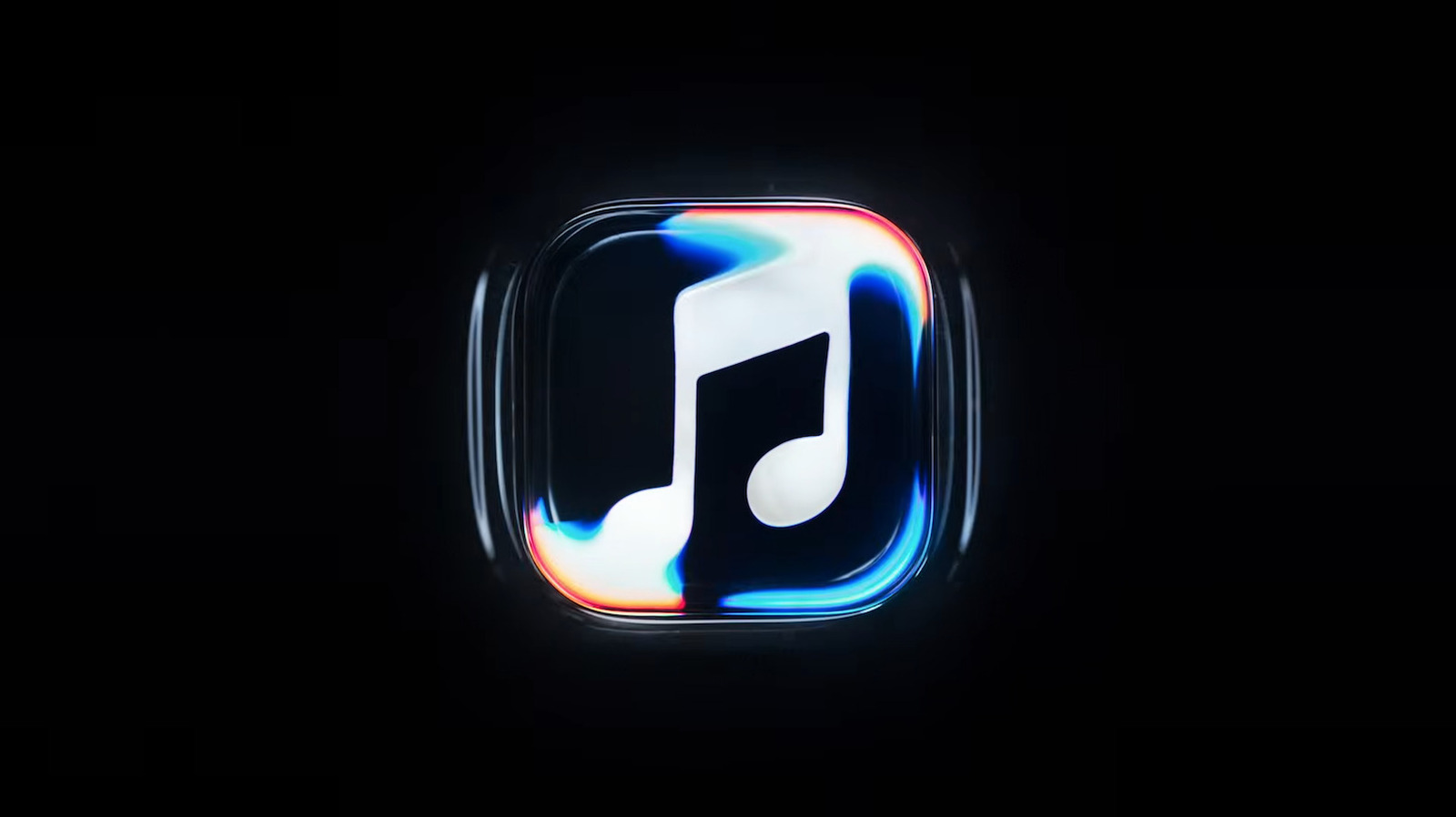
There's a new Apple Music logo and it looks like ripples in water
Executive Brief
The 30-second read
Apple has introduced a redesigned logo for its Apple Music platform featuring a ripple-inspired aesthetic. This visual update signals a shift in branding strategy for the tech giant's primary audio streaming service.
- 01Apple redesigned the Music logo to resemble water ripples
- 02New branding indicates a potential update to the mobile application's visual interface
- 03Current reports suggest the design may eventually replace the existing application icon
Go deeper · Equip playbook
Business Travel Management 2026: Program Blueprint →AI-generated summary · Verify at source
Maybe they should use it as the app logo instead.